Cisco
As a passionate graphic designer, I thrive on creating functional and visually stunning designs that are not only visually appealing, but also highly effective in communicating key messages. One of my recent projects that I am particularly proud of is the creation of a Pocket Guide for the internal teams at Cisco.
Client
Cisco
Project
Cisco CX Cloud Beta Program Pocket Guide
Category
Print Design
Type of Work
Presentation
Strategy
Branding
Communication
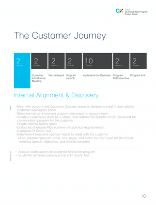
The Pocket Guide is a concise and handy reference tool that provides quick and easy access to important information for Cisco's internal teams. The design approach I took for this project was minimalistic, focusing on clean and simple design elements that convey information clearly and efficiently.
By adhering to Cisco's brand guidelines, I ensured that the Pocket Guide seamlessly integrated with their existing brand identity, while still introducing new creative ideas to elevate the overall design.
The minimalistic design of the Pocket Guide not only enhances readability and usability, but also reflects Cisco's commitment to innovation and cutting-edge technology. The strategic use of white space, typography, and color palettes creates a sleek and modern look, while the carefully chosen graphics and icons add visual interest without overwhelming the content.
The result is a visually appealing and highly functional tool that Cisco's internal teams can easily carry with them and reference on the go.


In addition to adhering to brand guidelines, I also brought new creative ideas to the table. By employing innovative design techniques, such as using infographics and visual storytelling, I was able to present complex information in a visually engaging and easily digestible manner. This not only made the Pocket Guide more engaging, but also increased its effectiveness as a communication tool.

In line with minimalism, I utilized a limited color palette that consisted of clean and sophisticated hues that complemented Cisco's brand colors. The colors were strategically chosen to enhance readability, create visual hierarchy, and evoke a sense of professionalism and trust. I made sure that the colors I used in the Pocket Guide were consistent throughout the design, creating a cohesive and unified look and feel.
To add visual interest and engagement, I also incorporated visuals such as graphics and icons into the design. These visuals were carefully chosen to convey complex information in a simple and visually appealing manner. The graphics and icons followed the minimalistic design approach, with clean lines, simple shapes, and subtle details that complemented the overall aesthetic of the Pocket Guide.


